
When we decided to build our banking platform using a cloud native architecture, we were very aware of all the benefits. Having faster releases, reduced costs and improved scalability, not to mention how reliable our systems would become, meant it was an easy decision.
But it's so satisfying to see that even now, years into our journey, we're still reaping the rewards. In this article we share how we were able to quickly build a bird's-eye view that is proving increasingly helpful for our threat modelling which was made possible by taking advantage of the consistency embedded in the way we interact with this modern architecture.
Threat modelling at a glance
Validating the effectiveness of our security controls can become challenging very quickly if we don't have a broad understanding of the data flows within the platform. If we don't know where data gets processed, then we can't be sure that we're enforcing the correct security boundaries.
A single customer journey will often trigger multiple requests to various services which makes documentation increasingly difficult, especially since each development team is responsible only for their own set of microservices.
That’s why we need a centralized solution that provides all the information we need whenever we find a vulnerability. This solution should also help to understand the dependencies between components and emergent properties, such as latency within the platform. Having this picture will allow us to quickly triage any issue correctly and prioritise what has the greatest impact.
Legacy challenges of building a big picture
Gaining an understanding of data flows is a very laborious task for traditional banking organizations. They need to review lots of business process documentation from different departments and collect information from various disparate systems. In many cases, a legacy approach will have data flows that make use of technologies from several different generations.
Sometimes these may include REST APIs and Apache Kafka. But messages are often sent using older queuing systems like IBM MQ. Every so often, the data flow pattern involves different parts of the organization emailing Excel spreadsheets. All of these factors make it very challenging to build a big picture of the data flow especially when organizations are continually evolving and all of this needs to be kept up to date.
The storage of required information in a cloud native approach
The only way we could have our teams operate autonomously, without having to always refer back to a central authority is to build and test our code using standard pipelines which can ensure a consistent approach and provide multiple quality gates. This means that a lot of the data we need to enable us to do threat modelling across our organization, can be easily found and processed.
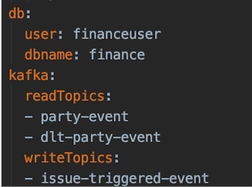
The first data source we noted was the central registry of our Kafka topics which includes all the topics that are being read from and written to. This is already declared and maintained by our teams as part of the DoD (Definition of Done) so there is no additional effort, and everything can easily be kept up to date.
This information is stored as part of our Helm Charts which makes it super easy to gather and process. Once we transform this into the correct data format, it will create the asynchronous part of our picture.
To complete our picture with the synchronous part, we want to include the REST API communication which is fortunately already maintained in our Pact Broker.
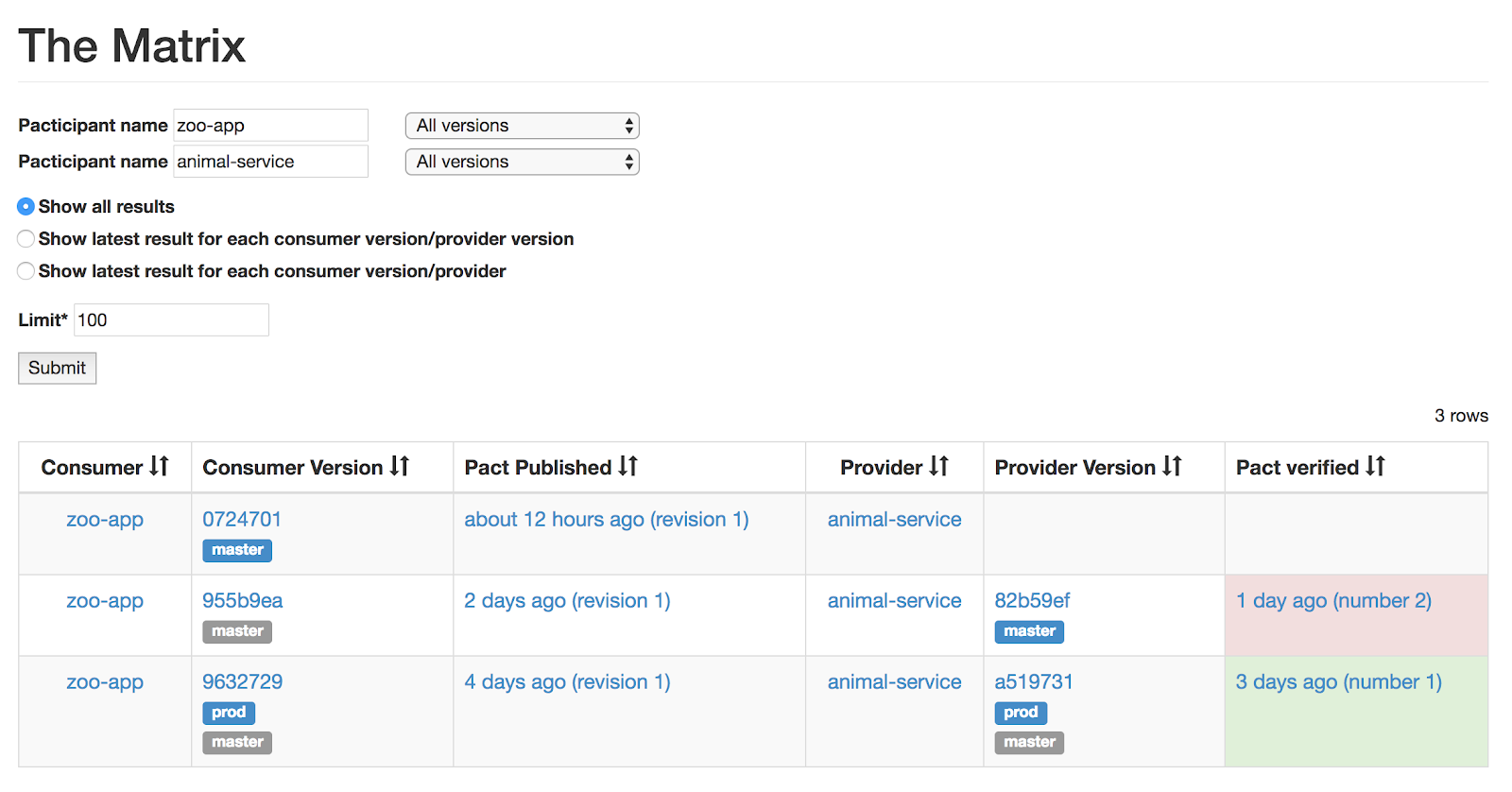
This application allows us to share and enforce the consumer-driven contracts between our microservices. The Pact Broker already provides an endpoint we can use to access all the data which will help us create the second part of the picture.
A quick way to solve the problem
There are many possible solutions to solve the same problem and while there will always be opportunities to enhance the solution, we believe that, in many cases, it's important to start by working with what you have, and continually improve during future iterations so that you don't spend too much time admiring the problem.
To build our picture, we need just a few things:
- The data we already work with
- A tool which can help us quickly visualize that data
- A way to process and feed the data into the tool
In our case, the data came from Helm files and the Pact Broker. We continued by processing that data using some Python scripts to transform it into the right format for the visualization tool.
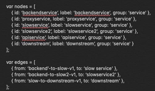
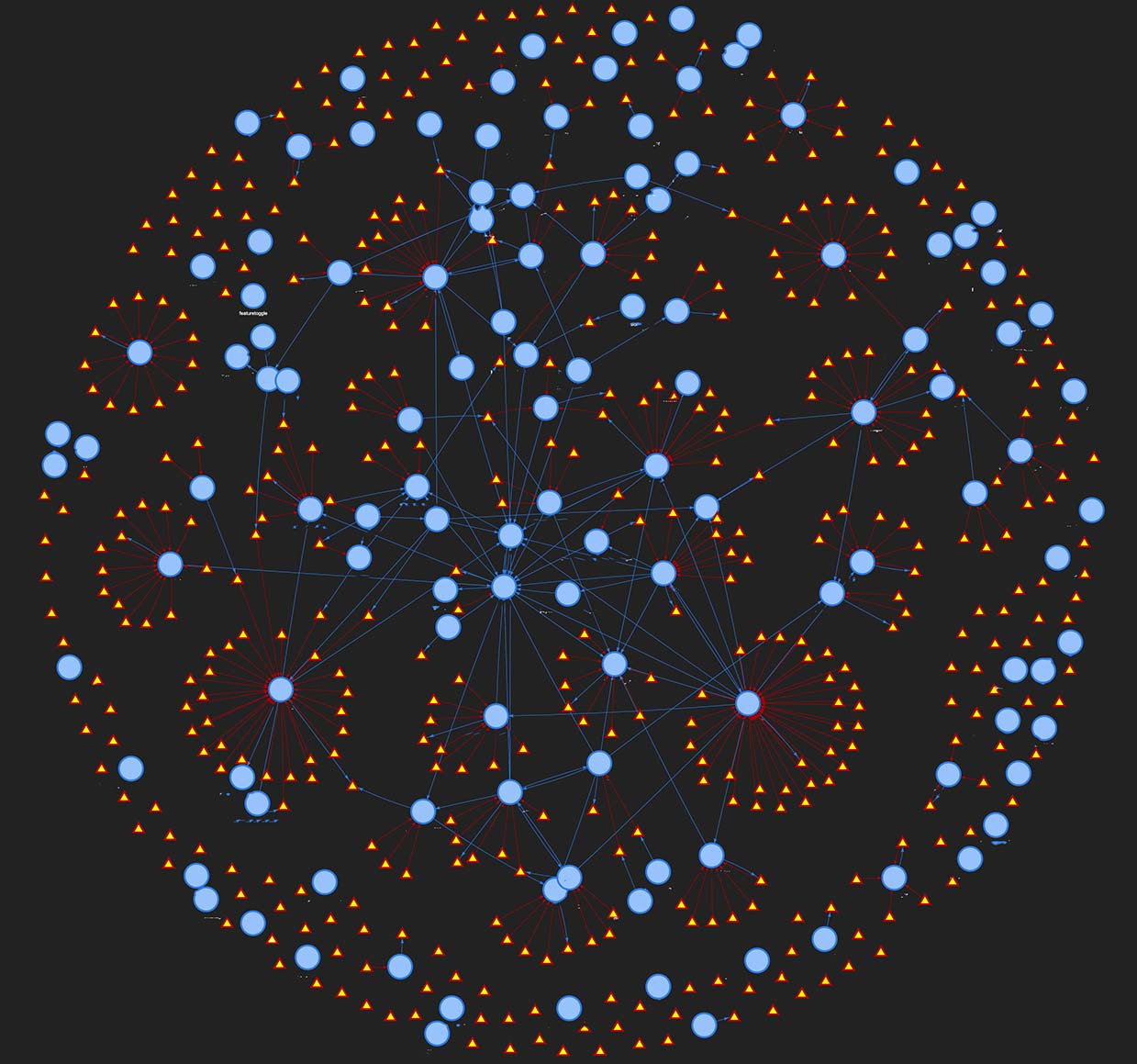
The data you have and the way you process it will be totally dependent on your scenario. However, we do want to quickly mention vis.js which was used to create an interactive view that we can now open and embed in any web page.
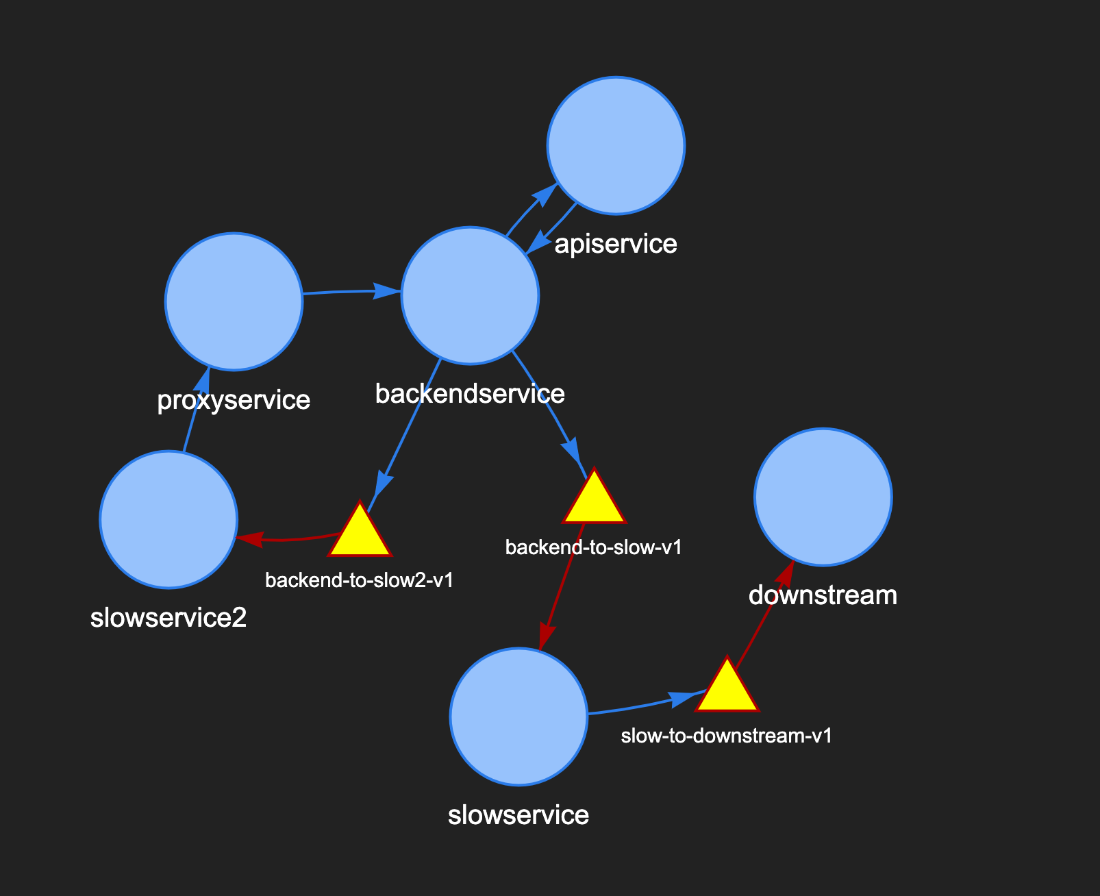
You can choose a template from their website and start experimenting with the provided JavaScript files to decide how you want to visualize your data. In our case, we've represented microservices with blue circles and Kafka topics with yellow triangles.
The blue arrows represent outbound communication for a service, while red arrows denote that those services consume data from the associated Kafka topics. You can very quickly build a small interactive diagram as above which can be dragged, zoomed and enriched with popups or any other metadata you need.
As long as all your data is stored and maintained in a consistent way, you can combine all local results and scale this up to include your whole organization to ultimately build a picture that looks more like the one below.
Using this for threat modelling
Creating this visualization is nice, but does it actually offer value? We've already made use of this capability to improve the effectiveness of our threat modelling. By having an easy way to see the communication flows we ensure tall the interactions of our services are considered. We want to be able to reliably use this tool, together with other approaches to consistently threat model our platform. A good place to start with further improvements is to ensure the correctness of the information displayed.
This helps to contextualise any vulnerabilities and act as a living document that we can improve as we go along. We can now start thinking about annotating service and data flow classifications, overlaying other boundaries such as product domains, mapping user journeys, or even automating our service criticality assessments.
Conclusion
There's so much information already available when you're working on a cloud native, heavily automated environment. Because everything is machine readable, there are many problems that can be solved by integrating multiple data sources and scripting that information into a useful tool. As development pace increases, it's important to be autonomous but follow consistent approaches that can help us spot these opportunities where solving a difficult problem is actually well within reach and doesn't require a complex or expensive solution.